Friday, 5 May 2017

Introduction


For my final major project, I intend on producing a fashion feminist magazine as an outcome. In my reflective journal, I will be documenting my process of this project. I will also be reflecting and discussing any issues that may occur during the production of the magazine, and reflect upon the progress throughout. Showcasing evidence of the development of ideas and of any changes to my initial concepts.


Proposal Feedback  (Review, reflect, and develop)

Today I had an important meeting with my tutor, who will be guiding me through this project. She gave me feedback on my project proposal, on how I can progress and move this project forward. 
What went well:
"Great introduction including research exploring feminism in fashion and its cultural evolution... excellent project focus which clearly outlines your final outcome and the reasons behind your idea. You consider a global distribution and your reasons for incorporating a digital platform. Well considered USP that identifies your idea as a gap in the market."  
"The target market is described in detail using demographic terms including their lifestyle and income with a visual profile to support... Well identified competitors including detailed press pack information to help you further understand the competition and define your core consumer"  

- My unique selling point delivers the needed fashion editorial and content required by my market, but differentiates from other magazines with its feminism slant and approach to fashion concepts. 
Reflecting on todays feedback, I've learnt that I have clearly underpinned my target audience and competitors. Making me feel prepared to create a magazine that could be easily sold in my chosen target market. I've also acknowledged that their is a huge gap in the industry for a fashion feminist magazine, which leaves me at an advantage of creating an outcome that is unique and different. 

Initial magazine aesthetic concept

Initial styling inspiration and concept


This is my initial creative direction for the overall style of the magazine. I like the femininity and minimalistic approach but I feel its too safe and not pushing the boundaries as much as I would like. I want to develop the style of the magazine into something I believe will be more whimsical, creative and eye catching to my target market. Create editorials that are more thought provoking and capture the interest of my market. 
"Do be clear about overall content and tone of voice of the magazine" - This is something I will consider. I need to pin down exactly what my content will contain, and what tone of voice, as I have a target market that appeals to both millennial age and generation X (30s). 
"You include considered direction towards your overall branding and I agree with your intention to carry out a focus group for feedback - your appendix includes well considered questions that will really help you to define your proposal"  - Before I make a final decision on what direction to take regarding the overall style and branding of the magazine, I will carry out a focus group with my target market for feedback first. In my focus group I will provide questions, and mood boards of two style directions I would like for the aesthetic outcome. One will be the minimal idea presented in my proposal, the other will be a vintage direction that has a more of a quirky individualistic style. Which I'm leaning towards more but need to ensure my target audience find that style appealing. 
I'm very happy to receive a B1 for my proposal, though there are some problem areas I need to address for this project.  

  • I mentioned in my proposal that I will also be making my magazine available on the digital platform, to suit the demands of the new digital age, and make my magazine more accessible and portable to consumers. However, I will find that this will add extra pressure on my production of the magazine and I'd rather focus on producing a print of high quality, rather than a print and digital with a lack of quality. 

  •  As discussed, the issue of relying on an international company to print and produce my magazine isn't convenient and may be a risk to my productions schedule. Why? because I will be rushed to complete my project at least a month before deadline to send it off to printing company to give them enough time for it to me produced, processed and shipped to the UK. So I've decided to rethink my choice of production company to ensure I have a more reliable and sufficient delivery of my magazine. To avoid any problems that may occur using an international based company. Issues that the result will arrive late, affect my time management, or not print out to the standard I required.  

  • Another issue I need to address, is how I will be promoting my magazine. This is a key element to consider. I plan to set up social media pages, on Instagram and Facebook to advertise my magazine once I've completed a few editorials and content. To give the target market a glimpse as to what is coming available soon.   

  • To be clear about who will be doing each role in the production of this magazine; I will be the creative director. I will be styling each photo-shoot, and also plan and organise editorials, write the content of magazine, and design the layout of artwork and overall magazine design. I will be collaborating on photoshoots with photography and make-up & hair professionals that are available at Solent, as both of these skills are not my strongest. I will also be hiring professional models, as I believe good poses make a better fashion imagery.


My Production Schedule


Here is a screen shot of my production planner. This helps me keep track on my progress, and plan ahead tasks so I can be organised and know exactly what I should be doing and when I plan to do them.

It is updated on a weekly basis and occasionally modified to help keep my time management of the project running smoothly.


Last updated 24th February 

Focus Group Results and Feedback


To clarify my overall concept and style direction for my magazine. I conducted a focus group with my target market before I start finalises concepts for photo-shoots and begin the process of production.

I provided them will two directions for the magazine.
One minimal and one vintage, to get their feedback on their preferences and what they think will make them want to buy the finished product.


This focus group was essential for me to gather important information about my target market, so I can meet their demands, and make a magazine that could sell.


Direction 1


A minimal and feminine concept that is modern and fashion forward. This concept was my initial direction for the magazine in my proposal.

Focus groups opinion:

Likes:

-Loved the colour scheme
-Feminine quality
-Modern, minimal and ideal for fashion concious women.
-Simple styling, easy for readers to copy


Dislikes:
-Not very unique, as a lot of magazines have similar style
-Not versatile
-I will be restricted to the minimal style for images, wouldn't be able to explore other trends


Direction 2 


A vintage, quirky, and feminine direction. That makes references to past eras in styling.

Likes:
-Quirky and unique
-Imagery is more inspiring and intriguing
-Styling is different from the minimal mainstream magazines
-More Versatile with this style
-More available to explore different trends and reflect inspiration from different eras


Dislikes:
-Vintage style can look old fashioned when not done right
-Harder to link to feminism and feminist topics with a vintage style magazine
-Chance for magazine to look 'too girly' for its audience if images aren't executed right.


The overall favourite choice from my target market is direction 2, as it is a more interesting and versatile style that I can interpret in my own way. Focus group concluded they will find this style more appealing and will want to purchase a magazine with this vintage aesthetic.


I also asked my target market, what attracts them to a magazine?

Results:

A eye-catching cover with colours that stand out on the newsstands.
Cover image is 'pretty' and 'appealing to the eye'


Magazine name suggestions for a vintage quirky magazine:

-Felicity
-Violet and Pearl
-Pearl
-Verity
-Bette
-Lilly-May
-The vintage magazine
-Vintage Muse


The favourite was Verity as it is short, sweet and quirky. Suiting the style of the magazine.


Other questions asked for knowledge and understanding of the demands of my target market:

1.How much of a feminist are you?

"I consider myself a feminist, I find the topic very interesting and feel it needs to be celebrated and encourage more women to read up about it" 
"I think most people, including men are feminists now, or at least have a feminist view on something" 


2.Would you buy a fashion feminist magazine? And Why?

"Yes, I would love to be know there is a fashion feminist magazine available on the market. I would buy it on a regular basis"

"It would be refreshing to have something different on offer when I go to buy a magazine, and I would definitely buy one with a feminist angle to it"


3.What appeals to you in a fashion magazine?

"In a fashion magazine, I like to have visuals and images of latest trends that I can get inspired by"
"I like a mixture of fashion imagery, and articles that I find interesting and are easy to read. Anything to do with feminism I enjoy reading"

4.Do you prefer a more visual or written magazine?

"I prefer a more visual magazine yes, probably 70% visual and the rest informative content"

5.Do you prefer a lighter read/thinner magazine or a heavier/thicker magazine?

"I think lighter magazines are more accessible, and portable as I tend to get a magazine for when I'm traveling."
"A lighter magazine is much nicer and easy to carry around, and for a light read. I don't like to read anything too heavy and bulky" 

6.With the content, what do you find interesting to read about?
"I would be interested about feminist topics on fashion, make-up, or even film"
"Personally, I like to read something that is though-provoking but also light-hearted. Something that is inspiring" 

7.What female figures you find empowering and inspirational?

"Marilyn Monroe, because she embraced being curvy and womanly"

8.How much are you willing to pay for this type of fashion magazine?

"Depending in how many pages, if its 40-50 a light read, then around £3, but if its a heavier read, I would expect to pay £5" 
"I think £3-£4 would be reasonable" 

Pechkucha Presentation Feedback


For the Pechkucha presentation, I discussed my current work progress, finished outcomes, planned photo-shoots and future concept ideas. This will help me develop my project further and receive feedback from tutors and peers.


Initially, I was considering a hardcover, matt paper, and perfect binding magazine. For a luxury finish similar to Lula magazine. However, my tutors suggested I re-evaluate this idea, and suggested making my magazine different from my competitors with the printing. They suggested for my budget, that it would be more appropriate, and affordable to print on a thinner paper, and have it folded and stapled. Making it more transferable.


After getting a quote from my printing company for the change of idea. I found out it is more affordable and within my budget to print in stapled binding with 130gsm silk paper. A thinner but has high quality. Less likely to tear than matt, and more durable for the month its in use as its a monthly magazine.

Its also provides a vintage and authentic feel to it, lighter, more portable, and accessible similar to stylist magazine who prints in thin paper and is handed out free to London commuters during rush hour. Who I've witness who like to read something light but also informative during their daily journey.

This suggested printing option also changes my pricing for my magazine,  so it still suits my target audience. The cheaper the more appealing it would be to my market.

It will make my magazine a light, feminine and quirky read that offers inspirational fashion visuals with intellectual and thought provoking topics. Different form the mainstream magazine with inspiring quotes.


They also informed me of feedback about a Hitchcock Blonde editorial I pitched. The idea is a visual editorial story based on the blonde actresses in the Hitchcock movies and how they were represented. My tutors informed me that this was an idea that could be developed further in the sense that it can link to the feminist aspect of my magazine well and suit the vintage style. For this concept, I will put an article piece with the images to ensure it fits well with my feminism slant in my magazine. They advised me to research into the narrative, and representation of the female characters in his thriller film noir movies, such as The Birds and Psycho for influence.


The Queen and Tweedle Editorial

For my fashion section in my magazine, I intend on creating a whimsical fashion forward editorial, that tells a narrative through imagery and styling. The purpose of a fashion editorial story of a series of images is significant and essential in a fashion publication. All my competitors have editorial stories with avant-garde or whimsical images to inspire their readers. Enable to compete with the magazine, it is essential for me to produce a series of editorial images that appeals to my audience.

As I'm on a budget, and need to build my network, and also gain more skills in working in a team professionally, I will be collaborating with Lucy Bowler, and Maarit Hirvelaan. Both final year students, one who specialises in Make-up and the other in Photography. They've employed me as their stylist for a couple of their photo-shoots. We will be working together to produce whimsical images for their project but also I have permission to use these images for my editorial story. This is a great way to show I can collaborate with other people and work with other peoples briefs professionally. I will be providing all styling looks and will help direct the shoots to ensure the best quality images, and I will work professionally to meet their brief requirements. I also save money this way, as I don't have to financially support any models for these shoots, or for any photography equipment.
#Good working practices


The concepts they briefed to me where perfect for the style of my magazine and would work really well.


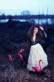
The idea of these shoots will be to create images based the Queen of Hearts and Tweedle Dee and Tweedle Dum characters from Alice in Wonderland, but they will be interpreted and modernised. I will be styling them fanciful and whimsical but with a vintage edge, but be stylish, fashion forward, and on trend. There will be a feminist perspective on the way we will be portraying these Villain characters. Villain characters, especially female villains are portrayed negatively and viewed as bossy, mean-spirited and who have no heart. This is a negative portrayal of women and we are aiming to twist this interpretation of villains, and highlight there 'bad' qualities as empowering. Diminishing the hatred view people have on villains when reading or watching fairytales, and instead empowering these characters for the power they hold. Reimagining the villain characters. With the Tweddle dee and Tweedle dum, they are not Villains as such but male characters that get up to mischief. We will be interpreting these characters as females to give a feminist slant to the narrative.

Team:

Creative Directors: Lucy Bowler and Maarit Hirvelaan
Photographer: Maarit Hirvelaan
Make-up artist: Lucy Bowler
Hair-stylist: Bryony Campbell
Stylist: Grace Parris
Assistant: Hattie McGovern


Queen of Hearts overall concept moodboard 


Location will be set in the local park and woodland area of Southampton. Smoke machines will be used to create a dark and intriguing atmosphere in the images. 

Make-up and Hair moodboard


Tweede Dee and Tweedle Dum overall concept moodboard 


Location will be in photography studios, and will twin female models will be used.


Make-up and Hair moodboard 


Outcome of Photo-shoot

Queen of Hearts


Backstage shots


Reflecting on today's shoot

Today, we spent 9 hours on location shooting. Firstly, we went to Southampton Common park and shot images using smoke machines in a wooded area. This went well, however we ran over schedule and spent too much time in the park, when we were scheduled to go to a second location for 3pm. This location was in the grounds of a National Trust house, with landscape gardens and idyllic scenery to capture some more shoots. We arrived too late to the second location and they denied our entry, so to overcome this issue we drove further into Hampshire to search for interesting park or woodland areas. It wasn't until 5pm we found a spot of woodland by a lake, which had an interesting gloomy appeal. It was a fast pace photoshoot as we had to ensure the model wouldn't miss her train and capture as many shots of the second outfit before sunset. Time management was poor today, and the process of this shoot was rushed. However, we managed to work well under pressure in a team and achieve a series of strong high quality images. Which I'm excited to edit, and layout in my magazine story. 
#Initiative and Independent Learning
#Good working practices 


Edited outcomes of Queen shoot


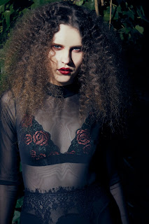
The overall shoot was successful, as we all worked hard to meet the brief set out by the creative directors and achieve great professional images. Make-up and hair truly depicts a queen like character and resembled the Queen of Hearts with a hint of red, and 'mad' overdone volumised hair. With the styling I achieved what they briefed me. They wanted her to look vampy and sexy but not exactly like the fairytale villain. No hearts or red was wanted for the styling, which I initially found challenging. However, I made references to the Queen of Hearts through hints of red roses embedded on garments and used ruffle neck chokers to give a regal vibe. Overall I consider my looks innovative and cutting edge because they reference a villain in a updated and modernised way. With the movement of her skirts and sheer fabric to show a 'sex appeal' that they required. When creating looks based upon a fairytale character, they tend to be the exact same representation or look rather fancy dress. I've established a new way who portraying a fairytale character and making them look relatable, modernised and empowered. 
#Understanding of trends and styling conventions 

I'm aware that my styling ideas are innovative because I've compared my work to the fashion imagery of Tim Walker and Annie Leibovitz. Tim Walker is cutting edge and avant-garde but magical. He reinterprets fairytales in his own way, but compared to my work, I capture a more modernised and more wearable look of a fairytale character. My work looks closer to reality than his work. Annie Leibovitz also captures fairytale narrative, but resembled a complete replica of the story and character. Her work and Tim Walker's work are very credited but I find my photos are innovative in the way that they capture a more relatable, empowering and modernised fairytale character. 
#Devise Innovative and Appropriate Solutions to a problem or a brief

Tim Walker - fairytale photography


Annie Liebovitz - Disney photography 


In my view, what could have been improved or prevented was the lack of time management, as we could of shot more outfits within the 9 hour timescale we worked. Overall, I am pleased with the outcomes achieved. 

These images will be presented along with the Tweedle dee and Tweedle dum outcomes. 

Outcome of photo-shoot 2

Tweede Dee and Tweedle Dum 

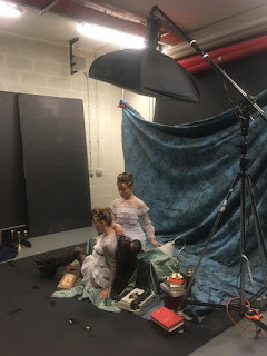
Backstage shots


Prior to the shoot I was given the brief to style the Tweedle characters as feminine women with a dark romance twist. In total six outfits were required, which is challenging because I am financially unable to support that many outfit changes. However, I didn't want to come across as unprofessionally, or pull out as I wanted to be apart of these images.  So to overcome my financial issue, I teamed up with a fellow fashion styling student, Hattie McGovern who agreed to assist me with the styling and sourcing of clothing. In industry terms, I was the Head Stylist in this work place situation as I had the overall say in the outfit choices and styling, and my assistant supported me on choices. My assistant agreed to split the cost of the styling for this shoot with me, which solved the financial issue and enabled me to meet the styling brief to my full potential. 
#Good working practices
#Initiative and independent learning

Edited outcomes


In my estimation the shoot went very well, and compared to the previous shoot with the queen. The time management was on schedule and ran smoothly. 

The styling conventions of the Tweedle twins would be masculine because they are male characters, but I exceed the styling conventions and established a new way of styling these characters. Using twin models and using the trend 'dark romance' which entails lace, embroidery, brocade, ruffles, thrills and embellishments. This trend suits my magazine style well, and creates that whimsical look I'm aiming for. 
#Understanding of trends and styling conventions

I would consider these images to be innovative and cutting edge as I've not seen any other interpretation of the Tweedle Characters in this new modern way before. Its innovative because its showing females can depict a male character. Breaking down gender limitations and restrictions. Women can be presented as the male character, there is no boundaries in these images.  
#Appropriate materials and production processes

Overall this was a successful outcome. 


Cover Editorial Shoot

For my magazine cover, I am inspired by these vintage magazines. I intend to have a similar layout and portrait image to capture the magazines style. So the target audience will immediately know what type of magazine this is and will be made aware that its vintage inspired.


I intend on creating a cover image that pops and stands out from other mainstream magazines, and look eye catching to the audience. Colours will be feminine and pastel schemed, but also suit the name of my magazine. As I'm calling my magazine a quirky vintage name Verity. I want the cover model to be known as Verity's cover girl of the month.


I also plan for the cover girl to be in a editorial story that is based on a vintage era, and provides fashion inspiration for the target audience. It will also have a feminist slant to the cover girl story.


For the cover image and editorial story I plan to have a feminine 50s inspired look. Using a pastel palette in a studio location.

Overall Concept Moodboard 


Hair and Make-up


Retro waves, feminine 50s make-up, with a modern twist and update. This look will clearly make reference to the vintage style of the 50s. Ideal for the likes of my audience and style of magazine.


However, to develop this editorial story further, my tutors informed me to make sure I make reference to other peoples work and theories. As my magazine will have a feminist slant to it, these images will need to have a feminist perspective to the concept.


As an idea to develop this concept further, I intend on basing my cover girl on the 1950s housewife. But instead of having her as the inferior sex and domestic goddess which the housewife women were in the 1950s, I intend to create a housewife that is rebelling against the norms and gender rules. A feminist concept that will suit my magazine and readership. Which I will pitch to my team for this shoot.

Miles Aldridge 50s housewife inspired imagery 

'Neglective motherhood' and 'Home Chic' Series


Inspired by Miles Aldridge take on the housewife gender role, I plan for my model to have an attitude that breaks down the gender barrier and rebels against the rules of society.
Her poses with different props will achieve this narrative.

Poses include:
-smashing a cake with hammer or rolling pin on gingham kitchen table
-smoking
-pouring vodka into a teacup
-martini glass
-empty wine bottles
-stuffing face with cupcakes or a slice of cake (goes against the idea that women should watch their weight and size)
-face expressing an can't be bothered attitude and challenges you.


However, I've reflected on the practicality and the financial side of this idea, and have come to a conclusion that it wont be affordable for me to fully provide the amount of props, clothes and resources too achieve this concept to its full potential. Also discussing this with my team members, they agreed that it will be too complicated and money will be wasted if it didn't work out successfully. So we agreed as a team to keep the images simple and have a different feminist perspective to it.
#Devise innovative and appropriate solutions to a problem or a brief


Development

The development and change of the narrative behind my concept displayed in my moodboards, is to be much simpler and light-hearted. As I don't want my audience to feel they are overpowered by strong feminist theory and point of views as soon as they open my magazine. I want them to be able to keep on reading. So my cover girl editorial will be about celebrating and empowering the ultra-feminine look of the 50s. Embracing femininity, instead of portraying it as a inferior quality to be had. My magazine is all about empowerment and feeling inspired. 


The Team:

Creative Director and Stylist: Grace Parris
Make-up and Hair Artist: Sara Gerwat
Photographer: Charlotte Wilson

Location: Solent Photography Studios


Outcome of Photo-shoot


Backstage Images


Reflecting on the photo-shoot

Overall the shoot was successful as I pulled together styling that met my brief, moodboard and represented the 50s style in the ultra-feminine way I intend. Despite the model arriving late, we managed to stay on schedule and work well together as a team to achieve the best possible images. #Good work practices

No issues were encountered during todays shoot, which was a good result. The make-up and hair  perfectly executed the 50s style I pitched to my make-up & hair artist and made some great close up shots and head shots for the cover.


Edited final images 


Cover 

With the photography, the lighting could be improved in the full length shots, because there was a crease/dent in the backdrop which we couldn't hide. The studio lighting highlighted the dent even more and is visible in the images. With my retouching skills that I used at a later stage to fix the issue was a challenge, but it did improve the problem to an extent. Now I feel confident in using them in my final magazine.
#initiative and independent learning

What went well was that we as a team created a series of strong cover shots for the magazine that will capture the eye of my audience and suit my magazines overall aesthetic. We did capture some great mid shots to use in the cover girl story.

It wasn't until editing I noticed that the full length images cut of the shoes. The photographer didn't fit the whole body in the image very well, hence why I've had to opt for mid length shots.  I would redo the shoot, but realistically I didn't have the time and the studios were too busy the following weeks to re-shoot.


I do consider these images innovative, despite their simplicity, they do represent an editorial look that is avant-garde in a vintage way. It wouldn't be a wearable outfit for everyday, but inspiration for my readers to get styling influences from. Also using appropriate clothing brands to suit the target markets monthly income, making the outfits seem achievable and affordable to the audience. #Appropriate materials and production processes

The final images show an understanding of a vintage styling conventions. It reflects 50s trends with the full skirt, pearls, waist belt, pencil skirt, real vintage handbags, and collar knits, all creating an hourglass shape which was the ideal of that era. But modernise by almost a monochromatic pastel palette. It may not be clear in the images, but once I layout and add text to the story it will clearly reference and demonstrate my feminist approach to the concept. Celebrating ultra-feminity and all things feminine as styling inspiration for the spring/summer. Empowering feminine qualities.
#Understanding of trends and styling conventions

In my estimation, this shoot has been successful to a degree. In terms of being professional, I have managed my time well, and kept myself organised and others organised. All team members were assigned to their jobs for the shoot 2 weeks beforehand. They were all briefed prior to the shoot about my ideas and what I intend to achieve. They were also informed of my slight change of direction and development of ideas before the shoot day, to enable a smooth process of the photo-shoot and prevent any confusion. I would agree that I have kept professional in the process of this shoot and followed the protocol and responsibilities of being the creative director.
#Good working practices


The Hitchcock Blonde Editorial Feature

With an interest in fashion of the 1960s, I'm inspired by the cinematic style of the Alfred Hitchcock movies and I intend on exploring the dangerous world of the blonde femme fatale character he used in his movies.

I want to create an editorial story that combines fashion with a feminist concept. Create high fashion images that suit the vintage style of my magazine and provide inspiration, but also portray the story of how the Hitchcock blonde was portrayed in the Alfred Hitchcock movies.

As part of the editorial story I will have an article discussing how the women suffer mercilessly at the hands of troubled men in his films. This article will explore the accusations of misogyny that haunted Hitchcock's career and explore the world of the Hitchcock femme fatale character in his movies.
Why he thought blonde actresses made the best victims in his movies and how feminists saw it as a negative portrayal of women. 

From the Pechkucha presentation feedback, I've learnt from my tutors and peers that this concept is ideal and interesting for my magazine, but will need to develop it further. Hence why I've decided to accompany my images with an feminist article piece. 

To get accurate research for this editorial story, I will be using primary and secondary sources from his movies, and use the books 'The Women Who Knew Too Much: Hitchcock and Feminist Theory' and 'Laura Mulvey: Visual Pleasure and Narrative Cinema' to provide theory to my article.  I'll be looking at his movies and the portrayal of women in a feminist point of view. 


Definition of the 'Hitchcock Blonde' 

-The Hitchcock Blonde, is a beautiful, sophisticated, poised woman who carries with her an air of mystery and indirect sex appeal. She carries the film as an unexpected source of duplicity, and can be a cunning and intelligent adversary. 

This definition of the Hitchcock blonde gives me as starting point as to how I will represent this character in my images. I want to empower her with sophisticated styling, make-up, and hair. But through poses, props, and photography I want to portray the concept of her being 'on edge', 'devious' and 'in trouble' similar to the position of women in his movies. Capturing a narrative that she is in a dark thriller and in the hands of troubled men. 


For inspiration I watched Alfred Hitchcock movies to study the way the blonde actresses were portrayed through their character, role and how much power they holds. Their intimate and dangerous relationships with men, the styling, and overall cinematic imagery. 


Psycho 1960


Thriller and Horror in a Film Noir genre

Dramatic German Expressionist-style shadows that create dark, murky atmosphere.  
Strong aspect of film is the feisty, sexually charged femme fatale 
Janet Leigh who plays Marion Crane is the leading female character who holds sophisticated sex appeal but has troubled face expressions and Alfred focuses on this using the film noir lighting on her face.

The femme fatale character is an instigator for trouble and bringer of bad luck and receives mental and physical punishment. She is killed off by psychologically tormented Norman Bates because of her promiscuity and criminal behaviour. Her underwear turns from white to black when she steals money. Suggesting she is a devious, sexually charged character that soon gets her comeuppance by a man- this is where I can see why feminists thought Hitchcock was a misogynist.
The overall fashion style is 50s but enters into the 60s era. 

Birds 1963


Thriller/Horror genre

Tippie Hedren plays the blonde heroine Melanie Daniels who faces a punishment in the form of a bird attack by crazed black birds. A film that reveals what increasingly seems to be a bitter Hitchcock. The film uses similar lighting to focus on the drama and mood and fear in the actress face. Emphasising on the idea that she is in a murky world and victim of punishment. 

The styling of the blonde actress is very similar to the styling n Psycho. It represents early 60s fashion but holds again sophisticated sex appeal but more glamorous with more fur and pearls. 

The Hitchcock iconic icy blonde actress was an important element in his films, as it was the source of aesthetic pleasure and a victim of 'fetishistic' torture and punishments. The use of blonde hair in his movies and the way he portrayed his favourite blondes as the feared woman has led to a negative portrayal of women as sex objects. The idea that they were used to be looked at. Was the use of the  untamed 'blonde seductress' a warning to women that their promiscuous ways and strong sexuality wont end well for them? Were his representations of women a simply reflection of the society and fears of that time? 


Source: The Women Who Knew Too Much: Hitchcock and Feminist Theory by Tania Modleski (Routledge, NY, 1989) 

'HITCHCOCK HEROINE'

Editorial overall inspiration moodboard


Another element I find inspiring from Hitchcock movies, is the use of telephones. Especially in movie Dial M for Murder staring Grace Kelly, Hitchcock's favourite blonde.  I intend on using a retro telephone as a prop for the model to pose with to help create a thriller narrative in the images and emphasis the Hitchcock influence on the women. Viewing the aesthetics and scenes from this movie will help me inspire my images and model, but also use as a reference to support my feminist point of view in my article piece. 


Dial M for Murder 1954


MAKE-UP & HAIR


The model has to be blonde and have a Grace Kelly look to her features for me to fully re-create the famous and controversial Hitchcock blonde icon. The hair will be feminine and emulate the late 50s to early 60s style with smooth hollywood waves or a neat up-do similar to Tippie Hedern in Birds.  It will be modernised and be bold to empower her character as the femme fatale.  I intend to have a more avant-garde edge and daring look that represents the characters more devious and troubled side. Representing the narrative that she is in the hands of troubled men and bad luck is coming her way. Showcasing the murky world of the blonde femme fatale through the drama of the eye make-up and hair. 


PHOTOGRAPHY


I want a film noir essence to my images. Taking inspiration from the Alfred Hitchcock cinematic style where he uses strong lighting to highlight and focus on the subject which is the icy blonde actress. Inspired to create images that have a dark thriller atmosphere by using a film noir approach to composition and lighting. It will be shot in the photography studios to experiment with lighting. 


For poses and photography I'm inspired by Laurie Bartley. A photographer who uses influences of film noir style and lighting to create mood and atmosphere in her contemporary imagery.
Her collection 'Ballerina' and 'Mind over Matter' inspire the lighting and composition for my own images. I intend to recreate this type of lighting to emphasis the mood of my models and the character they will be portraying in a dark and msyterious world of Hitchcock's thrillers.


'Ballerina'


'Mind over matter' 


Styling Inspiration


The Hitchcock Blonde appeared in his movies throughout the 50s and 60s. In my editorial, there will be an inspiration from 50s fashion and 60s fashion. My main focus for styling inspiration will be from the Birds and Psycho movie, but also Dial M for Murder for further inspiration for prop use, mood and posing.

I've been looking at contemporary fashion editorials that are inspired by the Hitchcock blonde, to help me with styling these eras.


MARTYNA FRANKOW STARS IN HITCHCOCK INSPIRED SPREAD FOR MODERN MEDIA BY STOCKTON JOHNSON, 2013


I'm inspired by the lighting and poses from this editorial. It really captures the horror and thriller atmosphere in his movies that the blonde actresses experienced. It tells the story of the Hitchcock blonde and her role in the movies well, which I intend to do in my images. The photography is similar to the style of my photographic inspiration which was photographer Laurie Bartley.

Styling - Vintage inspired A-line dresses and heavy coats to ward off the chills that could have easily come from Hitch’s regular costume designer, Edith Head.

Vogue China - Hitchcock blonde editorial 


The Team:

Creative Director/stylist: Grace Parris
Photographer: Maarit Hirvelaan
Make-up Artist: Lucy Bowler
Hair-stylist: Anna Lenton


Location: Solent Photography Studios
Date: March 20th or 21st 


Outcome of Photo-shoot


Reflecting on the experience of preparing this shoot:

Today, a week before the photoshoot, I spent 8 hours sourcing clothes and organising 3 key looks. I've given myself plenty of time to source the props and clothing before the shoot.  I found it challenging because there isn't many early 60s inspired clothing in the shops or online. I was loosing inspiration and my moodboards weren't helping in achieving the ideal looks I intend to create. For the styling, I intend to reflect a true Hitchcock Heroine from his movies, but interpret it in my own individual way. I turned to a fellow fashion styling student for help in sourcing clothing. She informed me of the university styling cupboard which provided me with more styling inspiration. The online look-book of the styling cupboard had vintage pieces that I could borrow and integrate into my  own pieces. I've learnt that online and shops don't always have the right clothing source that i need to complete a task, I can be inspired by second hand clothes which are more unique and create more innovative outfits. I finished today, managing to complete 3 key looks, which I am happy with and meets my brief for the shoot concept.
#Initiative & Independent Learning


Reflecting on experience of this shoot:

Today, I spent 6 hours in total on this photoshoot with my team. Overall, it did run smoothly and everyone was scheduled on time and we managed to shoot all outfits. However we did encounter a few issues. Ideally I would of preferred the make-up and hair stylists to stay during the shoot, in case of a make-up top up or a hair change. They informed me before the shoot, that they were free for the whole day but instead they insisted they had to be somewhere else on the day. So it was left to me, the photographer and model. I was pleased with the make up and hair, although the hair didn't fit my mood board brief entirely, and in the images it looked too dated and old fashioned. The hair styling didn't compliment the outfits or the model very well either. To overcome this issue, me and the photographer worked together to improve the overall looks and let the hair down. This solved this issue to an extent as the model no longer looked old fashioned in the images and it gave the looks a more youthful appearance. However, without a hair kit or any hair styling skills the hair didn't look smooth or neat when down in the images. So I feel this caused the images to be of less quality and look slightly amateur to me.
 #Devise innovative and Appropriate solutions to a problem or a brief #Initiative & Independent Learning

What went well was the make-up. It met the concept brief and complimented the film noir style images perfectly as the green eye make-up enhanced the troubled look in the models eyes and poses.

Another problem that we encountered during the shoot was Photography. It took a while to correct the lighting, and we found it challenging to create the film noir aesthetic without the images being too dark and gloomy. However, with Chris Overhand (professional) available in the studio, we got assistance to achieving the film noir lighting. With his expertise we were able to create the ideal imagery we wanted and the outcome of the photography was of high quality and met my moodboard brief. Together with my photographer and Chris Overhand expertise, I've learnt new techniques and skills in photography that I never thought I would be capable of achieving. The real satisfaction when finishing the shoot was a great feeling, and I am very excited to see the images retouched and printed in the final magazine. I'm hoping for the images to be integrated within the article, but also spreaded onto a whole A4 page for maximum impact to the editorial feature.
#Initiative & Independent Learning

                                                                  Backstage Photos


Edited Results


These are the final edited and retouched images I will be using in my magazine feature. In my estimation the overall shoot was successful because the final images depict the film noir style and capture the thriller mood of the Hitchcock movies I researched and studied.

The close up shots work better than the long distance shots as they are more dramatic and emphasize the character the model is portraying. They highlight the trouble blonde heroine in the image that I intended to create. Although, the poses could be stronger in my opinion as the model was shy at first but she soon felt comfortable after an hour.
The posing captures a mixture of emotions the blonde female roles experience in the movies. She looks strong and empowering and almost cunning in the red 'power' dress, but also looks on edge, troubled and scared in the close up images with the props. I reference the movie Dial M for Murder well in this. I believe I have referenced a feminist theory in my images with the styling as the model is capturing the strength of the blonde women in Hitchcock movies and highlighting the troubles they dealt with caused by men in a patriarchal society. I'm also engaging in a dialogue with the work of Hitchcock through the work that I've produced. As my styling depicts the sophisticated and feminine appearance of the blonde heroine that Hitchcock intended to represent in his movies.  #Understanding trends and styling conventions

It was important to have the styling similar to the styling in the movies so I could clearly demonstrate the female character.  Which was very appropriate to do in order to create images that complimented the article piece topic and the subject matter. Although the images I don't consider are cutting edge, but I do feel the whole concept behind them and the narrative and theory that they referred to is innovative. 
#Appropriate materials and production processes


I believe the outcome of this shoot is innovative and compared to other peoples work who have interpreted the Hitchcock blonde. Mine is interpreted differently with not as many props used, or backdrops like the work of Stockton Johnson in Modern Media.

To ensure that this outcome is suited to my magazine style, ethos and target audience. I plan to conduct a focus group for feedback before layout and printing to get valuable opinions from readership. This is an appropriate solution to any problems with the relationship between my work and my target audience.

However, I have received feedback from an industry professional, who deals with fashion images.
Bryony Garbett, an Oasis head office contact of mine and Head of E-commerce thought "that the concept idea would be fitting for my target audience and suits the vintage style of magazine. It will intrigue the readership and the final images depict that Hitchcock heroine very well. The only criticism is the poses. Wish them to be stronger and more empowering to emphasis my feminism ideas" 
#Devise innovative and Appropriate solutions to a problem or a brief


Overall, I have been professional in organising myself and others for the process of this concept as I ensured I had a blonde model first, so I could have plenty of time to organise the clothing to her sizing before the shoot. Also send her portfolio to the team to let them know who they will be working with so they can prep their looks before the day. I undertook more production tasks than anticipated during this shoot as I had to do a hair and make-up change myself, which I've done previously in last projects, but not my strength and wasn't prepared for that task. Next time I will bring my hair kit just in case I need to do a hair change myself. I've learnt and understand that professional expectations as the creative director of this shoot means making sure everything flows well, and that I have back up solutions to prevent any issues.
#Good working practices